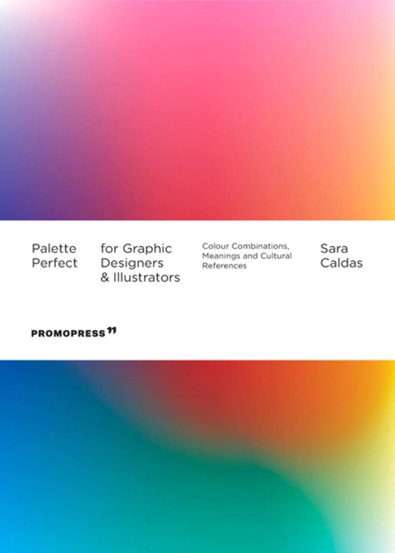
Palette Perfect for Graphic Designers and Illustrators
Colour Combinations, Meanings and Cultural References
The creative use of colour and its combinations in illustration, graphic and product design involves understanding how emotions are conveyed and how they affect our design and illustrations. We must also consider that colour is perceived differently in different countries and cultures. All this is widely explained in this second book in the Palette Perfect series, illustrated with projects by renowned international illustrators and designers, and organized by colours (identified with CMYK, RGB and HEX codes) and moods associated with the time of day. Based on real examples drawn from graphic design, product design and illustration, different innovative combinations and palettes are shown for each colour as well as the meaning it conveys. Intended for graphic designers, design students, fashion and interior design lovers, and all those interested in exciting and unexpected colour combinations that work.
About the author
Sara Caldas is a Portuguese graphic designer based in Barcelona. After obtaining a Bachelors Degree in Communication Design at the School of Fine Arts of the University of Porto, she moved to the Barcelona (Spain) to enrol in a Masters Degree at the prestigious ELISAVA design school under the same topic. Her final project was awarded the Silver Category at the 3rd ELISAVA Professional Edition Awards '15. Currently working as a Visual and UI Designer, she designs intuitive digital platforms for some of the most important banks and insurance companies in Spain, as well as for the European Commission.


